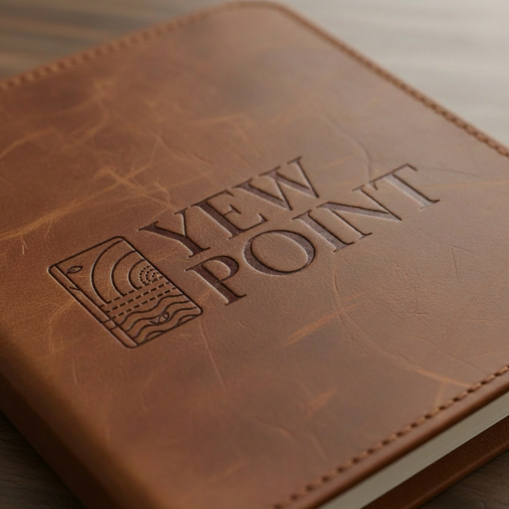
Yew PointEco Resort Branding & Identity
Yew Point is an eco-resort concept positioned as a luxury cabin escape immersed in the untouched landscape of Lough Ree. The vision combined sustainable tourism, biodiversity conservation, and refined hospitality into a nature-led destination rooted in preservation and education.
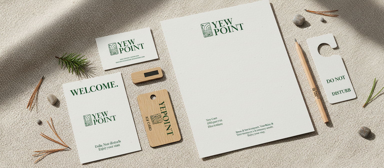
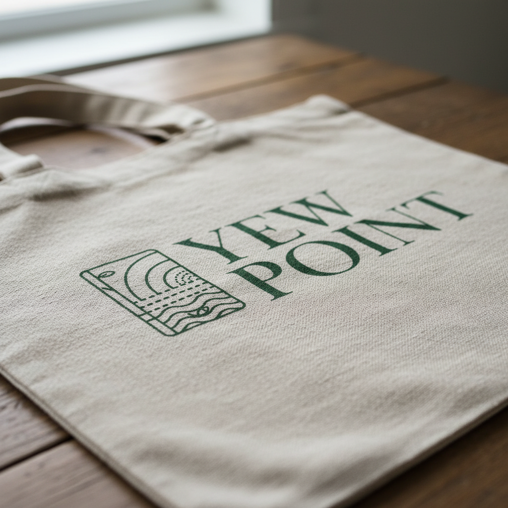
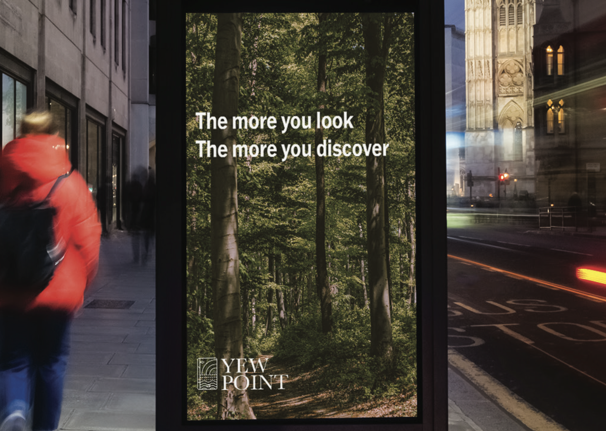
I was responsible for the logo design, brand identity system, and supporting marketing materials, developing a cohesive visual language that reflected both ecological sensitivity and premium positioning.
Context
The core challenge was to create a brand that felt:
Environmentally grounded yet luxurious
Rooted in ancient Irish landscape and heritage
Contemporary without losing authenticity
Flexible across wayfinding, print, digital, and experiential marketing
Yew Point’s identity needed to communicate sustainability without appearing rustic or overly commercial. It also needed to support long-term eco-sensitive development and tourism positioning.
Challenge
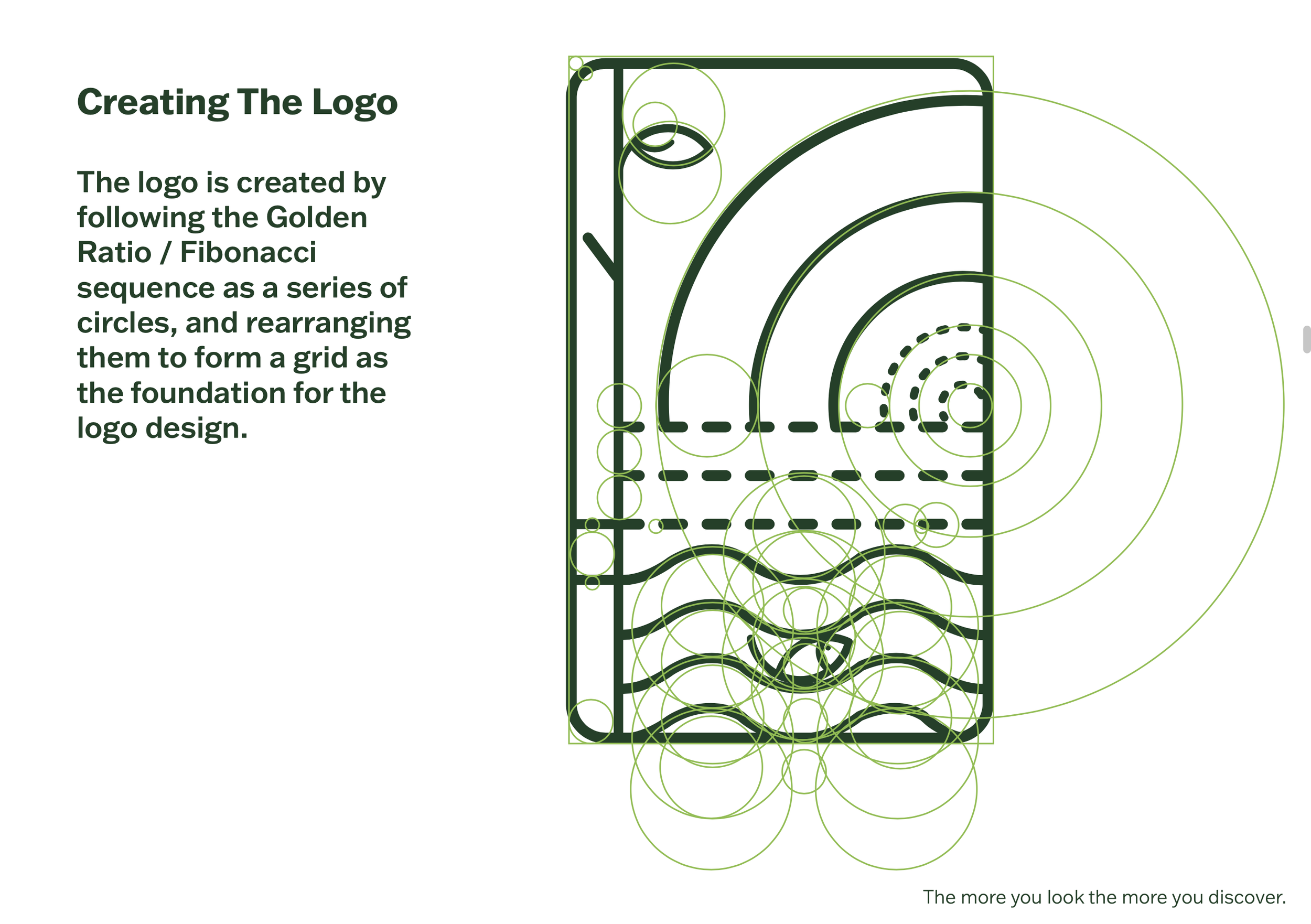
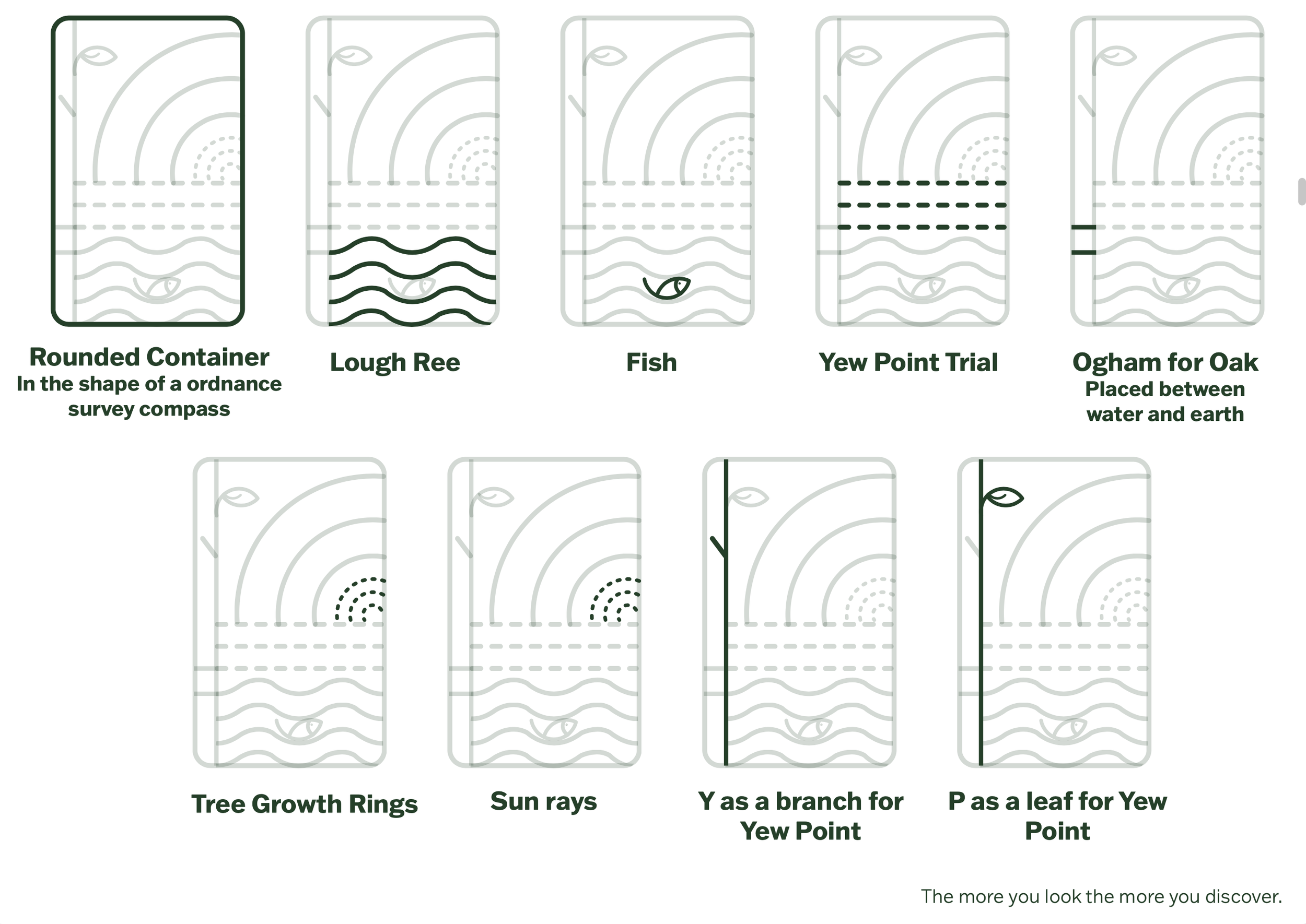
1. Concept Development
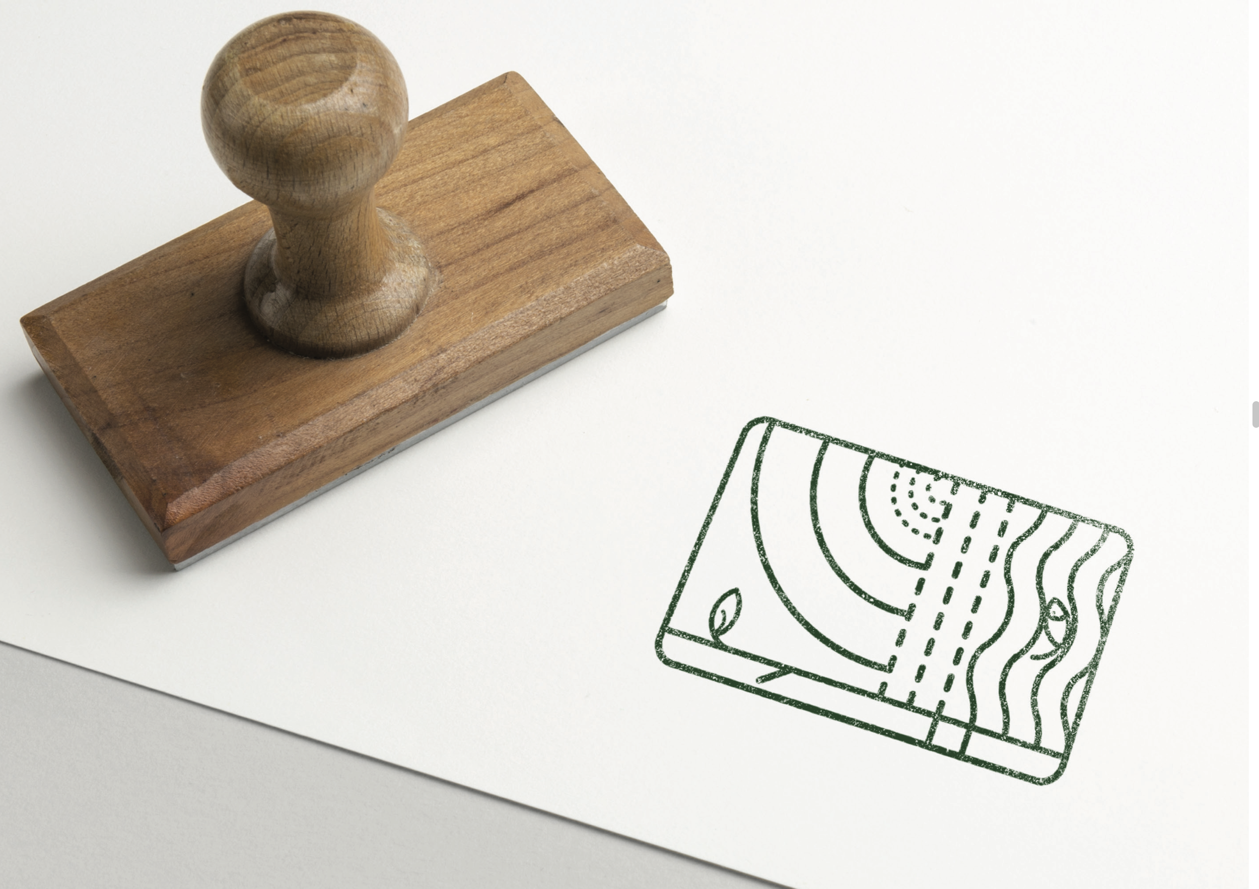
The logo was inspired by the site’s geography and natural symbolism:
Lough Ree’s shoreline
Native Irish forestry and ancient oak species
Tree growth rings
Ogham references
The relationship between land and water
The “Y” was subtly developed as a branch, and the “P” as a leaf, embedding nature directly into the typography. The container shape referenced an ordnance survey compass, reinforcing exploration and connection to place.
The logo grid was constructed using the Golden Ratio / Fibonacci sequence, ensuring balance and harmony reflective of natural systems.
Process
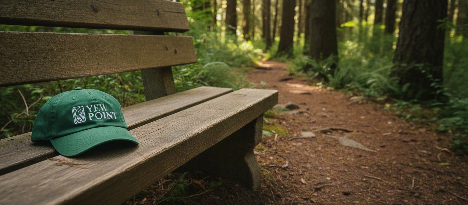
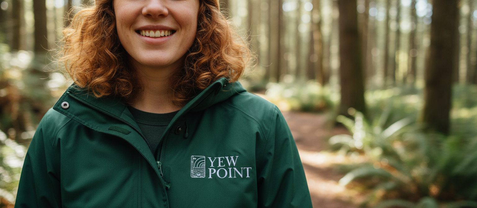
2. Brand System & Colour
A deep, organic green (#194926) became the foundation of the primary palette, symbolising native forestry and ecological grounding.
Seasonal expressive colours were introduced to allow the brand to evolve visually across Spring, Summer, Autumn, and Winter while maintaining a consistent core identity.
3. Typography
A refined serif (Baskerville) was selected for elegance and heritage, paired with Franklin Gothic for clarity and functionality.
This combination allowed the brand to balance:
Luxury and authority
Educational tone
Wayfinding clarity
Marketing adaptability
The final brand identity positioned Yew Point as:
A luxury eco-resort rooted in conservation
A destination defined by biodiversity and immersion
A sustainable tourism experience aligned with national environmental frameworks
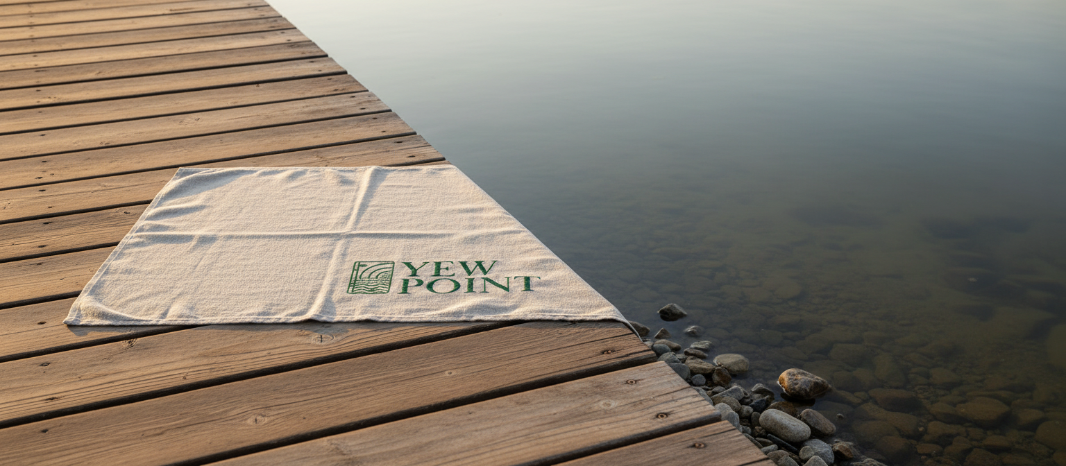
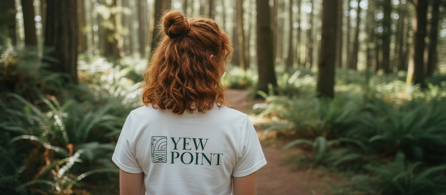
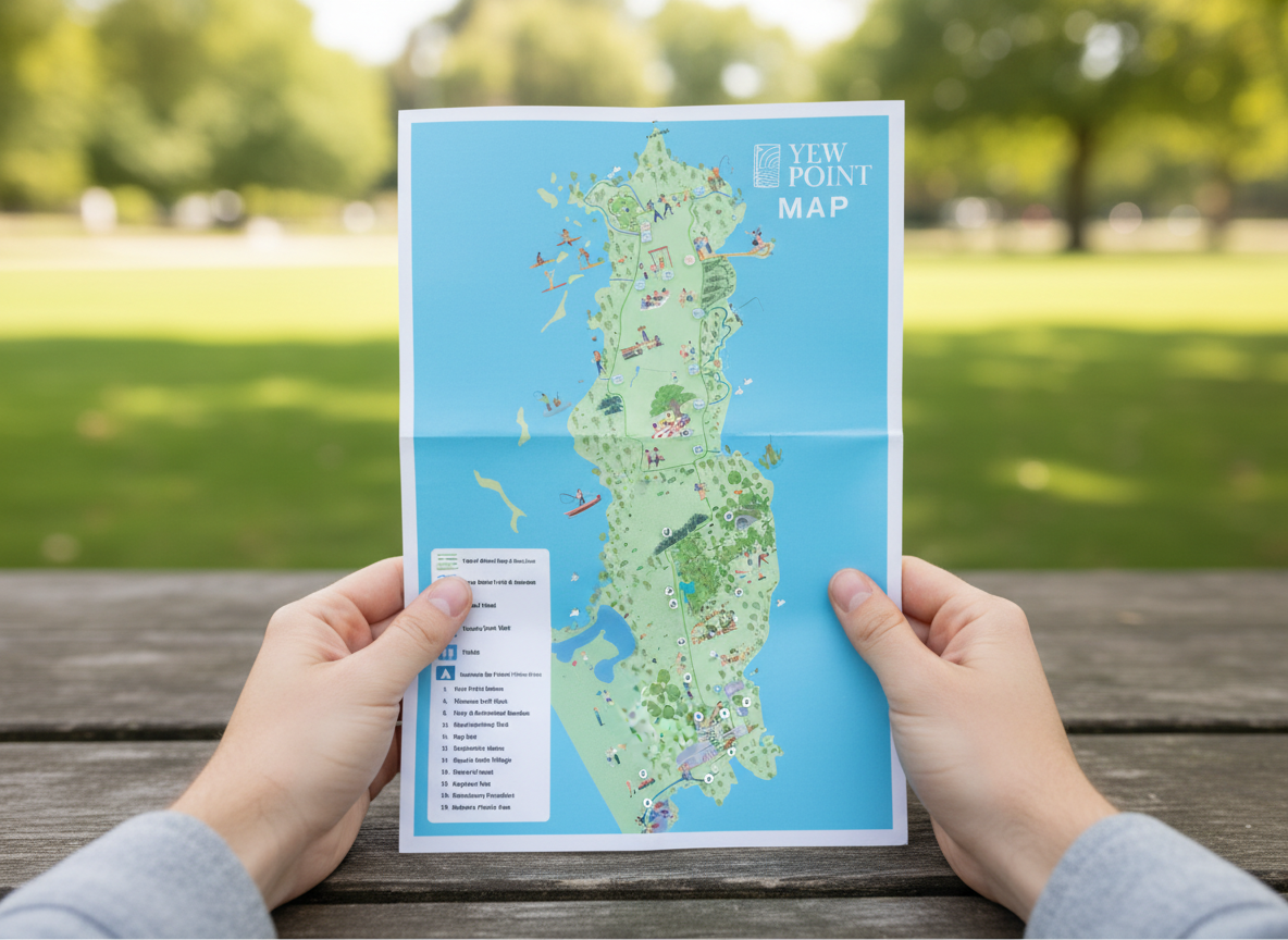
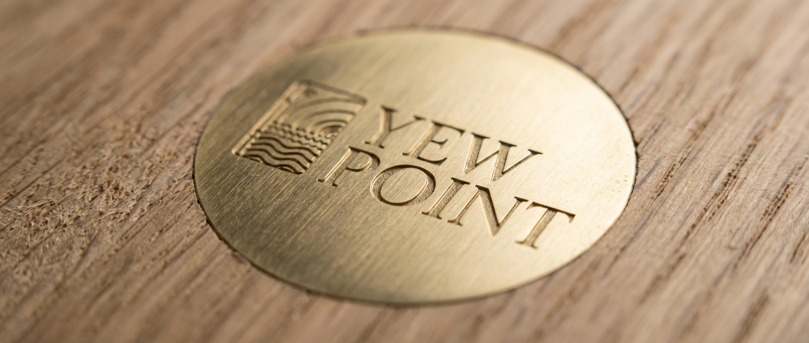
The identity system was adaptable across physical signage, experiential design, and marketing collateral, ensuring consistency from first impression to on site resort navigation.
Solution
The branding established a strong visual and conceptual foundation for the eco-resort’s development. It successfully communicated:
Environmental responsibility
Cultural and geographical authenticity
Premium yet grounded positioning
The identity supports long-term sustainable tourism messaging and provides a scalable system for future expansion.
Results