Oat Milk Packaging design • Context
As part of a personal design exploration, I created an oat milk packaging concept that challenged the expectation that everyday consumer goods must feel neutral or predictable. This project was driven by my interest in packaging design and shelf impact. A space where visual energy can stand out among crowded categories.
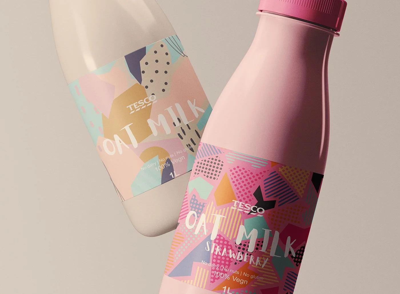
The plant-based category, particularly oat milk, is often dominated by muted, earthy tones and predictable design cues. The goal was to push beyond these category norms and explore how packaging could capture attention, communicate product benefits quickly, and resonate with today’s health-conscious shoppers without relying on cliché visual language.
Challenge
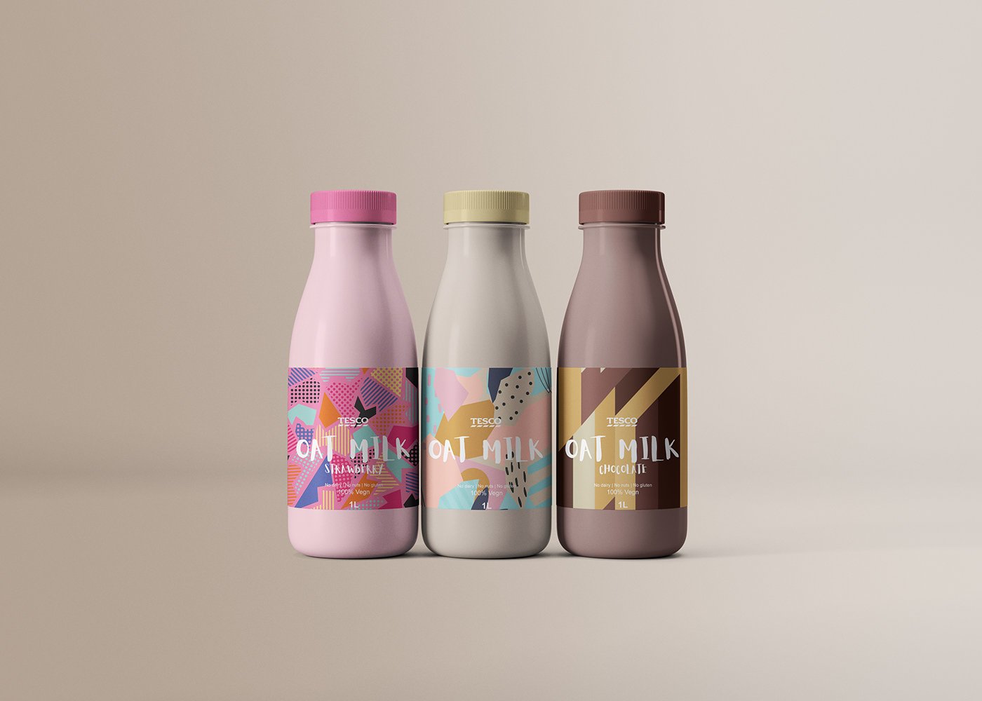
To break away from typical conventions, I focused on three core design drivers:
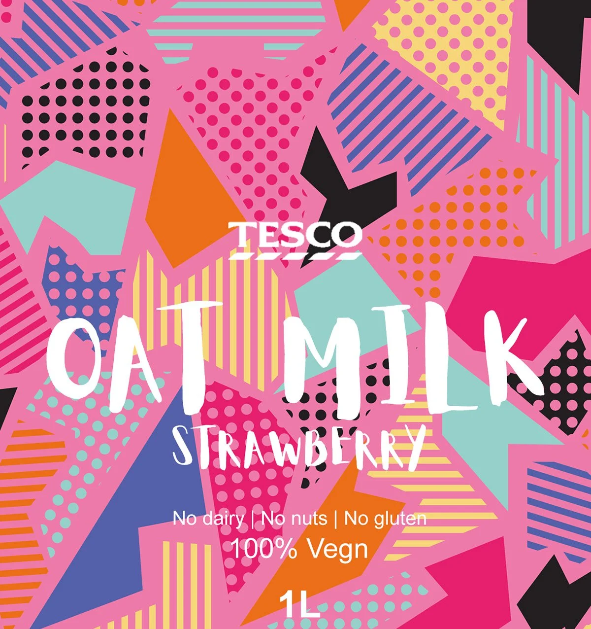
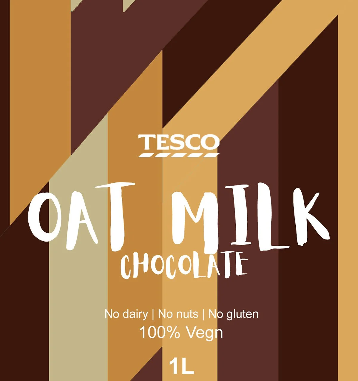
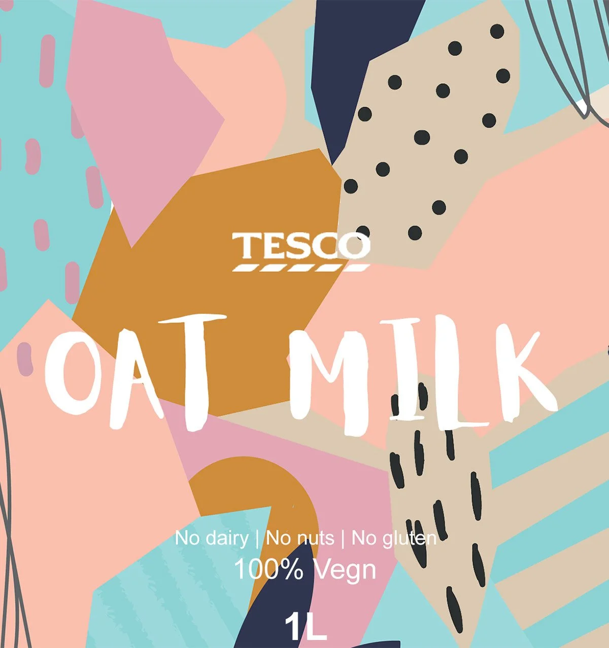
Colour and Energy: I developed a vibrant, fresh palette that contrasts category norms while still feeling food-appropriate and tasteful.
Playful Illustration: Custom illustration elements were introduced to give the packaging personality and a sense of joy, helping the product feel memorable rather than generic.
Typographic Strategy: Clean and clear typography was combined with expressive graphic elements to ensure legibility and highlight key information without clutter.
Process
The final design delivers a packaging system that is fresh, modern, and attention-grabbing:
A bold colour palette positions the product distinctly on shelf.
Playful illustrations create brand personality and help differentiate the product from competitors.
Clean typographic hierarchies make key product information easy to read at a glance.
Together, these elements form a cohesive design that treats everyday grocery packaging as an opportunity for creativity and connection.
Solution

